
|
|
|
| Wed Feb 7, 2001 - 12:00 AM EST - By James Hromadka | |
|
|
|
|
 Ok,
we have our compass calibrated and our maps loaded. Time to work
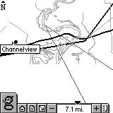
with maps. After tapping the globe icon from the Home screen or Reader
portion, you have a map screen with selective icons at the bottom.
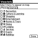
The large "g" icon lets you configure the content categories that will
be displayed: Recreation, Culture & Learning, Shopping, Entertainment,
Routes and Tours, Dining, Lodging, Services, Events, and Buildings.
 Each
content category has a nicely descriptive icon. You can also select
what sources you want loaded. By checking only needed categories
and map sources, you can increase the time it takes to finish drawing a
map on the screen.
Next to the "g" icon are quick-access icons to the Home screen and Reader screen. It would have been nice to have a Geode Info icon (a satellite maybe?), as the only way to get to the Geode Info application is to select View | Geode Info.
Map navigation is done by tap-and-drag to pan the screen and using the arrow icon next to the minus sign for zooming in on a specific area. Tap the arrow icon then draw a box on the screen where you want to zoom into. This is very handy, as you can actually zoom out almost 6,000 miles! You can zoom in to slightly less than 1,000 feet.
If you only want to zoom in or out, you can also tap the plus or minus icons. There is also a "slider" that lets you adjust the zoom control more quickly. I put quotes around slider because it is not a true sliding control. Tap and it zooms to that point. This isn't very intuitive to me, and it's easy to accidentally zoom out so far that your map becomes a tiny speck. I would rather have the slider removed or let it become a true slider control. I would also like to see the Visor's up/down hardware buttons used to zoom in/out.
Rounding out the icons, the far right icon lets you collapse the toolbar so that you get basically a full-screen mode.
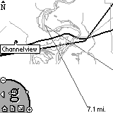
 Don't
like the toolbar? Go into Options | Preferences
and change it. Here you can change the Map
Control from the Default to a Corner design that was used during
the Geode's beta testing. The controls are the same, but it's nice
to have a choice.
Using the Map >>
Copyright ©1999-2016 Smartphone Experts. All rights reserved :
Terms of Use : Privacy Policy
VisorCentral is not not affiliated with or endorsed by Handspring Inc in any way.